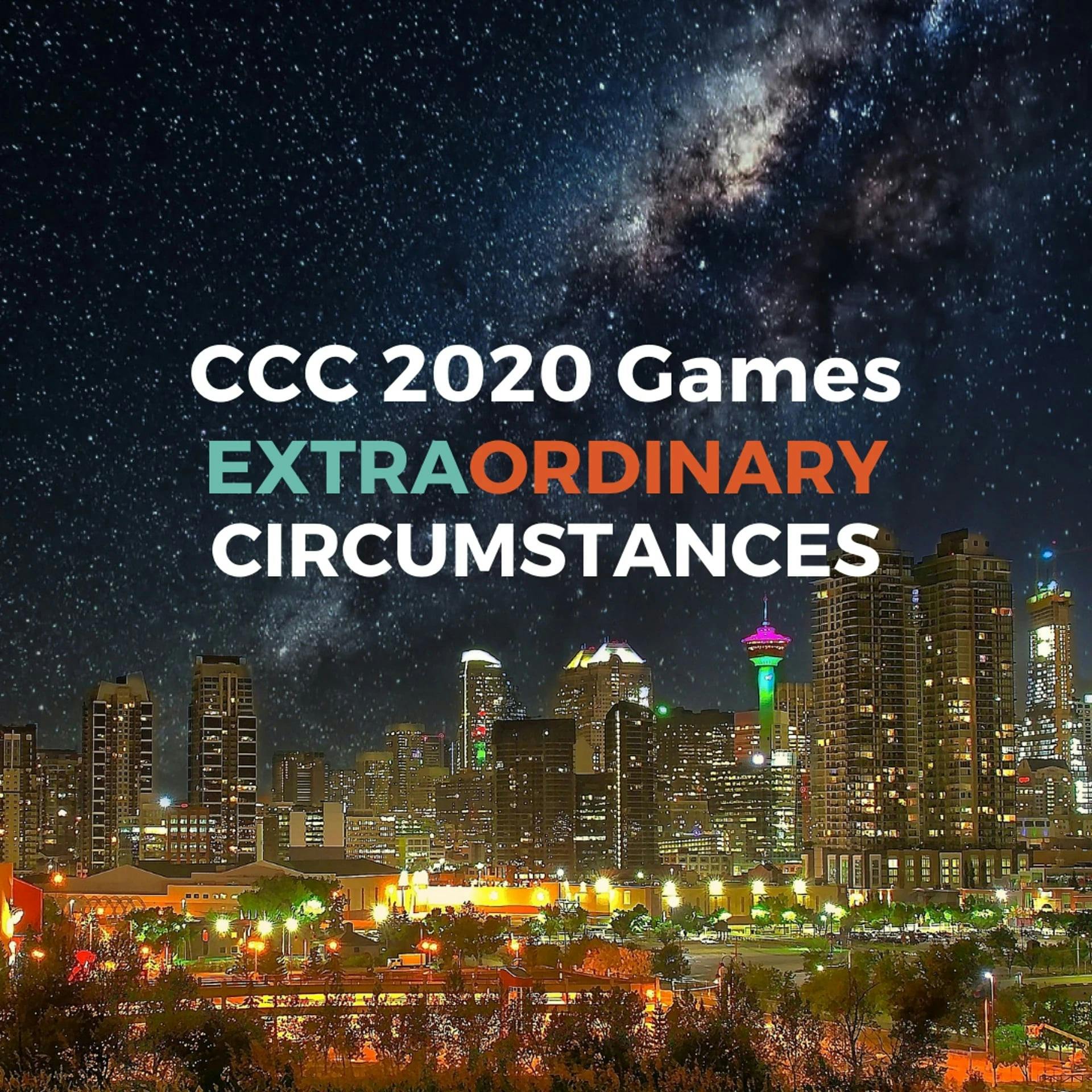
CCC 2020 Games - Design Challenge
For the 2020 Design Challenge, we challenged our companies to show us what 2020 looked like for their team and as usual, we received some great entries.

You probably know that we run an annual T-Shirt Challenge during the Games, but this year we decided to shake it up a little bit. We handed over the reins and let you pick what to design for our Design Challenge. Companies were challenged to show us what 2020 looked like for their team and as usual, we received some great entries - everything from masks and logos, to videos, gift card designs and even some T-shirts!
In the usual T-Shirt Challenge, we highlight our eight favourites before we narrow it down to one, so before we announce our winner, let’s have a look at our Top 8!
In no particular order:
Suncor Energy
Cisco
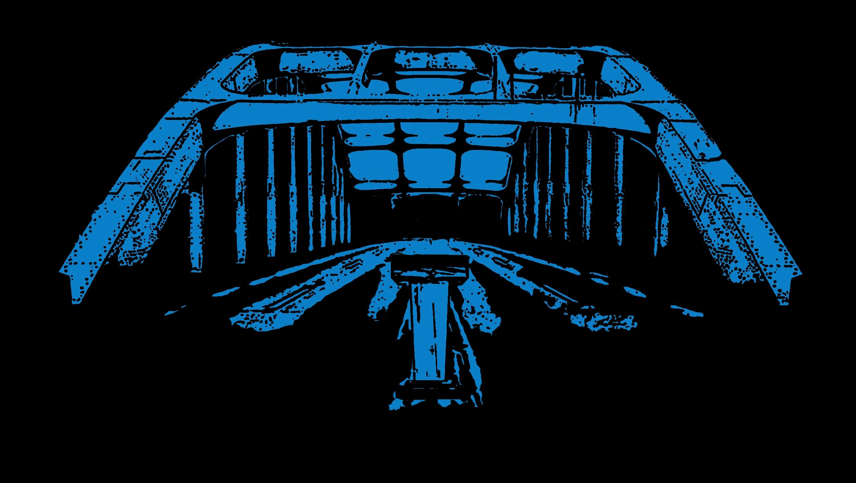
"For most in 2020, the words ‘extraordinary circumstances’ would conjure up modern day pictures of unity and comradery in the face of a global health crisis. Masks, Food Drives, Community Health Projects: A movement of Survival through Togetherness. This design represents that same message but for a different cause: Racial Justice. The Edmund Pettus Bridge, more commonly known as the Selma Bridge, was (and still is) a symbol of Unification and Survival for the Black community in the US when it became the backdrop for one of the most powerful movements in modern history. Civil unrest and protests have created a wave of change all over the world in 2020 and the momentum is beyond inspiring. The fight is far from over and Cisco proudly supports not only the efforts of our front line health care workers and families affected by this virus, it also supports the push for racial equality and increased diversity in the work place. When I see the Edmund Pettus Bridge, I truly see the “Bridge to Possible” and the overcoming of extraordinary circumstances."
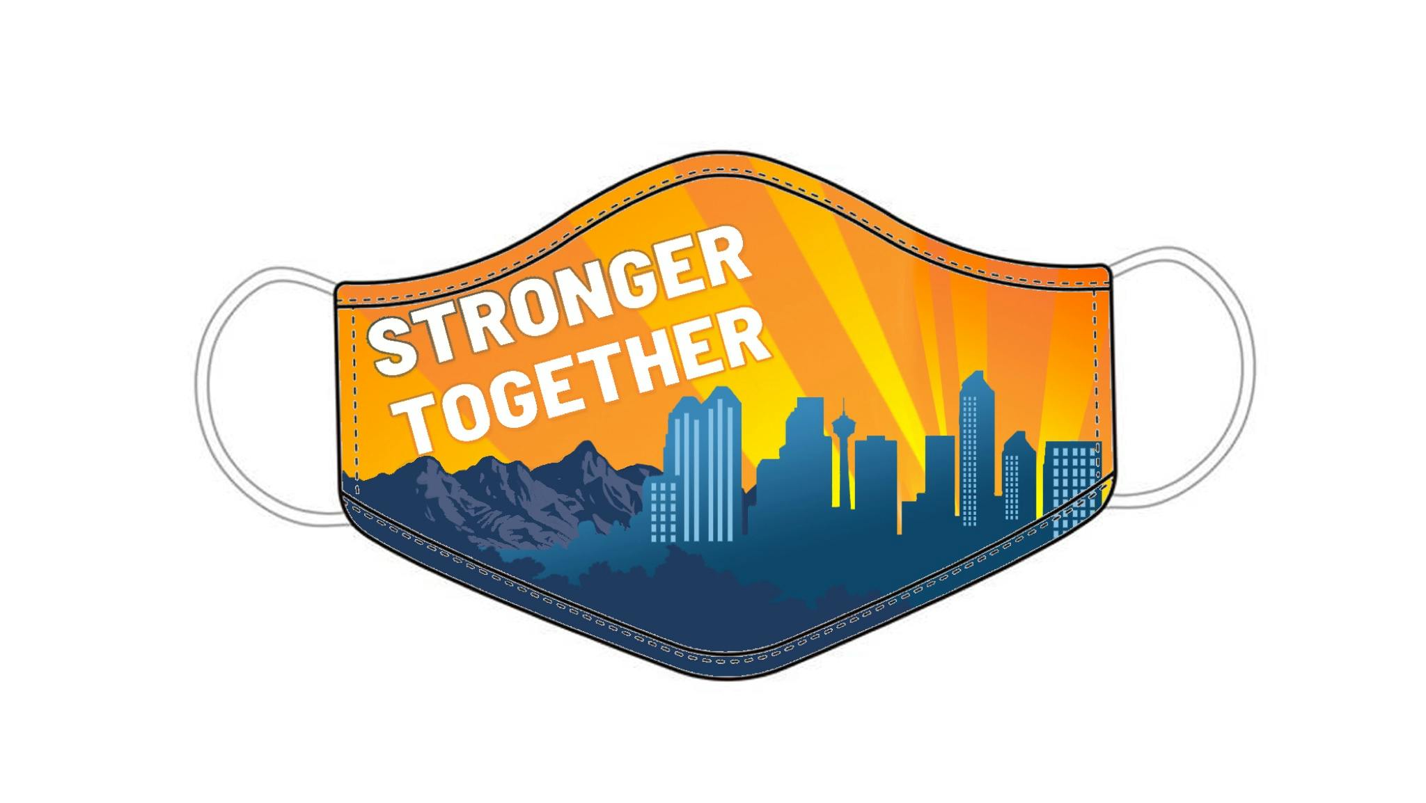
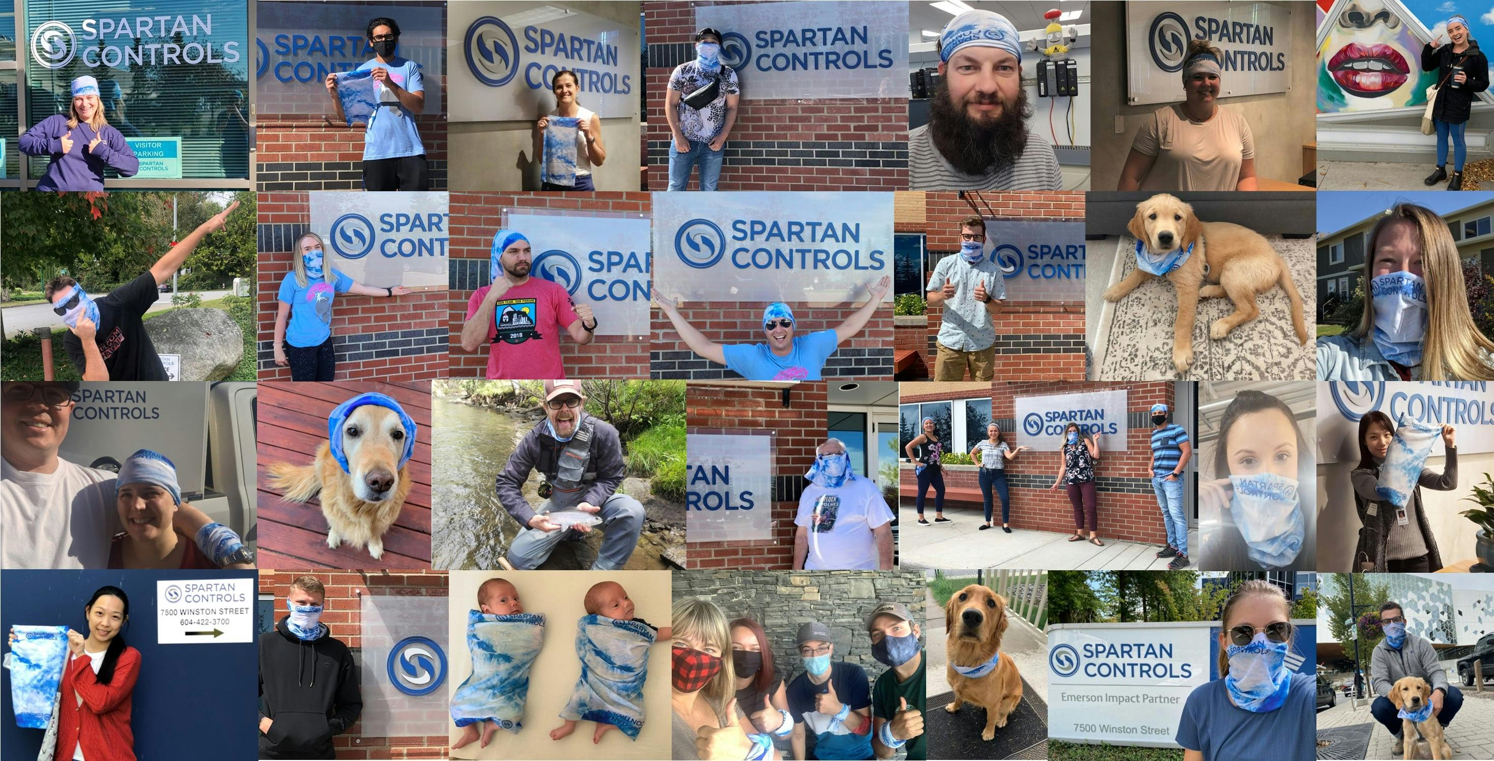
Spartan Controls
ATCO
“Extraordinary Circumstances: The overall idea is that despite the extraordinary circumstances, ATCO has pulled through with an extraordinary response: The ATCO blue mask is to show our physical response to the pandemic. The networking people on the side of the mask symbolize building new connections amidst the novel idea of social distancing. The people pulling each other up shows that despite everything going on, we can still help each other. The clouds vs. the sunset and mountains are to show that we can rise above on the other side of the pandemic. The dirt and plants/greenery are to show growth on the other side of the pandemic, which is already happening.”
Rocky View County
Daughter
"We're a small, Calgary-based agency, and many of our clients are small, Calgary-based businesses. We felt this was a small, optimistic way to shine a spotlight on these important institutions throughout our city, while helping them generate income during the lockdown, and during the continuing downturn. These are both still very much available for purchase, and the GC doesn't expire until 2021's sunny season, so there's plenty of time for some semblance of normalcy to return before then."
Imperial Oil
TC Energy
And the winner is...
We really liked all of these designs but there was one that particularly stood out to us. This design showed how this company had pulled through the year with their response to the pandemic, how their team had come together and the beginnings of new growth and connections in their workplace.
Congratulations to the winners of the 2020 Design Challenge - ATCO!